


Hey guys in this article we are going to talk about Styled-components.
What is Styled components and why do you need it as a React developer? Have you ever wondered what Styled-component is? Or perhaps you already know what it is but haven't taken the time to study or use it yet.
Are you looking for the best CSS-in-JS solution for your React apps, then this article is for you, whether you're learning about Styled-component for the first time, or you want to brush up on your knowledge of the subject.
In this article, you'll learn the fundamentals of Styled-components, and how to use Styled-components features to speed up the process of styling your react apps.
What is Styled Components
Styled components is a CSS-in-Js solution for React and React Native
It uses tagged template literals which allows you to write plain CSS that is scoped to a single component inside your JavaScript code
Styled-components is a library that is adopted by a large number of companies and it is one of the most starred React and React Native CSS solutions on GitHub
Benefits of using Styled-Components
Styled-components generate unique class-names for every style in your app, so we don't have to worry about class-name duplication
Styled automatically keeps track of which components are rendered on the screen and injects only their styles to the screen, which means we are loading the least amount of code necessary
There is an easier deletion of CSS, with styled-components every style is tied to a specific component, if a component is unused deleting the component automatically deletes its styles
Styling a component based on its prop can be done with Styled components
Styled-component takes care of vendor prefixing, for some of the newer CSS features we might have to explicitly write the CSS for older browsers, but with Styled-components we can write our CSS to the current standards, and it takes care of the rest
Prerequisites
This article assumes that you have:
Basic understanding of HTML & CSS
Basic understanding of React and React Hooks
A code editor.
And a browser (Chrome or Firefox recommended)
Setting up our Project
We set up our project in 2 steps
First, we create a React application using Create React App and we do this by running the following command in the terminal
npx create-react-app my-styled-components-app
Or you can use Yarn
yarn create react-app my-styled-components-app
The second step is to install styled components using the following command
npm install styled-components
Or you can use Yarn
yarn add styled-components
Basics of Styled-components
To start with, let's try styling a simple button element using styled-components
Import Styled components so we can use it in our react App
import styled from "styled-components";
The next step is to define a component with the styles using the imported styled function, this is done outside the app component
Const StyledButton = styled.button`
  border: 2px solid green;
  background-color: green;
  color: white;
  padding: 15px 32px;
  text-align: center;
  text-decoration: none;
  font-size: 16px;
  cursor: pointer;
`
We have just written some basic CSS styling.
But in styled-component, the CSS properties are written in bacticks
To use this style we invoke it in our App component like we would any other React component
<StyledButton>Styled Button</StyledButton>
It is as simple as that, we have just styled our button using Styled-component
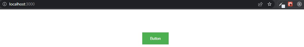
You should now have a button that looks like this
Keeping our styled-components in another folder
In large applications or large codebases, separate files are always created for styled-components
Let's try this out
Create a folder named components in the src folder of the React app.
Next, create a file named Button.js in the components folder.
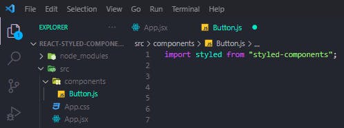 You should have a folder structure similar to this
First, we import styled-components into the Button.js file.
Next up, we move the StyledButton code from App.js into the Button.js file.
Then export StyledButton as a default function.
// App.js

import StyledButton from "./components/Button";

const App = () => {
  return (
    <div className="App">
      <StyledButton>Button</StyledButton>
    </div>
  );
};

export default App;
We can now import StyledButton into the App.js file and invoke it.
 Our styling remains the same
Adapting styles based on Props
At the moment our button has a background color of green, and the color is white.
Let's say we want a variant of the button, where if a variant is specified It will have a background color of white, and a color green
Let's take a look at how we would adapt our styling based on the props passed to the StyledButton component
// App.js

const App = () => {
  return (
    <div className="App">
      <StyledButton>Button</StyledButton>
        <br />
      </div>
      <StyledButton variant="outline">Button</StyledButton>
    </div>
  );
};
Let's duplicate the StyledButton component in the App.js file.
Next, we pass in a variant prop of "outline" to the second button.
Here styled-components will automatically inject the variant prop we passed in, as an argument, so we get access to the props in the Button.js file.
Now we have access to variant in the button.js file.
We can then use the variant prop to set the color and background color using a ternary operator
line 6 simply translates to
if the props passed in is equal to the outline then set the background color to white if not set it to green
Line 7 translates to
if the props passed in is equal to the outline then set the color to green if not set it to white
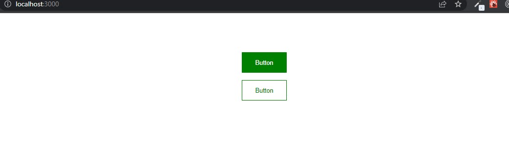 You should now have 2 buttons similar to this in your browser
Extending styles
When working with styled-components.
We will come across cases where we have to reuse most of the styles from an existing component, in another component.
Let's look at an example
<div className="App">
   <StyledButton>Button</StyledButton>
      <br />
   <StyledButton variant="outline">Button</StyledButton>
      <br />
   <BlueButton>Button</BlueButton>
</div>
Let's create a third button component named BlueButton
In this example, we want most of the styling of the first 2 buttons except the background color, and border color.
So we want to extend all the styling from StyledButton but we want to set a different background color and border color for the BlueButton.
Here we give a different background color to the third button, and we also set the border to none.
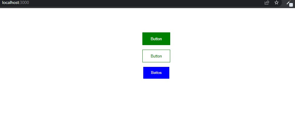 You should now have 3 different buttons similar to this in your browser.
Polymorphic Prop
Another feature of styled-components is the ability to provide polymorphic prop on a component.
On the BlueButton we can specify a polymorphic prop
<BlueButton as='a'>Blue Button</BlueButton>
This polymorphic prop {as='a'} specified in the BlueButton component changes the button element into an anchor tag.
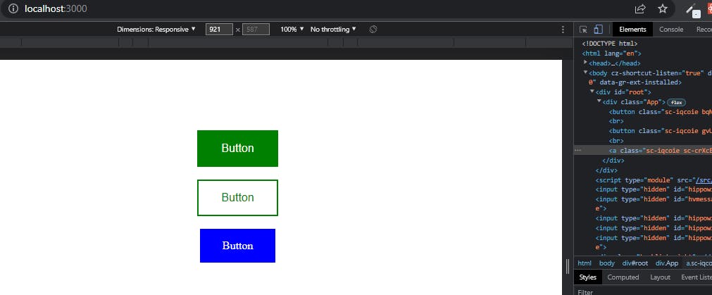 Inspecting the button in the chrome dev tools shows, that the Blue button has been converted to an anchor tag while the other buttons still remain a button element.
Pseudo-selectors
When styling elements with CSS or other CSS preprocessors a common requirement is to add pseudo-classes
For example styling elements when we hover over them or when an element is in focus.
Let's take a look at an example
On hover, let's change the color and background color of the StyledButton component
Now to specify a hover style in the StyledButton component
Here, in the hover styles, we simply set the color and background color to the opposite of what, it currently is, when we hover on the button
Theming
Now let's take a look at theming with styled components.
Styled components have full theming support by exporting a theme provider wrapper components
Let's look at how we would create a theme for our app
// App.js
import { GradientButton } from "./components/Button";
import StyledButton from "./components/Button";
//Themeprovider import
import { ThemeProvider } from "styled-components";


const App = () => {
  return (
    <ThemeProvider> //Themeprovider
      <div className="App">
        <StyledButton>Button</StyledButton>
        <br />
        <StyledButton variant="outline">Button</StyledButton>
        <br />
        <GradientButton as="a">Button</GradientButton>
      </div>
    </ThemeProvider>
  );
};

export default App;
First, we import the ThemeProvider from styled-components.
We then wrap the App component jsx with the Themeprovider component, and this component accepts a theme prop.
Next up let's define the theme prop that gets passed into the ThemeProvider component.
Const theme = {
        dark:{
        primaryColor: "#000" ,
        textColor: "#fff"
},
        light:{
        primaryColor: "#fff",
        textColor: "#000"
}
}
The defined theme is an object which has 2 keys "dark" and "light".
The dark key has a primary color of "#000" and a text color of "#fff", while the light key has a primary color of "#fff" and a text color of "#000"
<ThemeProvider theme={theme}>
      <div className="App">
        <StyledButton>Button</StyledButton>
        <br />
        <StyledButton variant="outline">Button</StyledButton>
        <br />
        <GradientButton as="a">Button</GradientButton>
      </div>
    </ThemeProvider>
Next in the theme provider component, we pass in our defined theme as the theme prop.
The Themeprovider here provides this theme to all react components underneath itself via the context API.
So all the styled-components will have access to our provided theme even when they are multiple levels deep (that's what the Context API does).
Next, let's look at how we would use the theme we have defined in our App.
For this example, let's create a dark-themed button in the button.js file.
// ./components/Button.js

export const DarkButton = styled(StyledButton)`
  border: 1px solid transparent;
  background: ${(props) => props.theme.dark.primaryColor};
  color: 2px solid ${(props) => props.theme.dark.textColor};
`;
Here we are going to extend the StyledButton styles.
To set the background color we have access to our defined theme through props, this allows us to set the background color of the button to primaryColor, and also allows us to set the color of the button to textColor.
Next, we import DarkButton from the Button.js file and invoke it in App.js
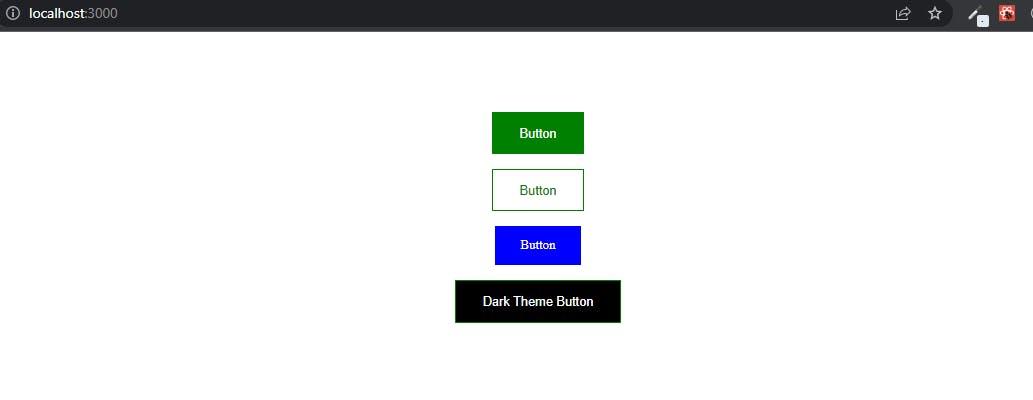 You should now have 4 buttons similar to this in your browser.
Conclusion
So that's it for this article, there's more on Styled-components we haven't talked about.
To learn more about Styled components, make sure to check the following resources 👇:
Give these resources a read.
As always thanks for giving it a read, give it a like 👍, share it with others too, and if you still got any questions then drop them down in the comments. THANKS FOR READING! 💖
if you enjoyed reading this as much as I enjoyed writing it, then Like and Share this with your friends and feel free to follow me on Twitter 👨💻.